Building & Scaling a New System to Empower Product Teams
Project Summary
At Study.com, I led the overhaul of an outdated, inconsistent design system that lacked reusable components, documentation, and templates, slowing down design and development. Starting with icon standardization, the effort grew into a scalable, cross-platform system called Eureka, built to serve a diverse user base across six product segments. Eureka significantly improved consistency, collaboration, and efficiency by introducing structured components, clear guidelines, and streamlined handoffs.
My Roles
- Design Systems Lead
The Team
- Senior Product Designer: Maddy Raff
- Illustrator: Natasha Medeiros
- Lead Engineer: Derek Closson
🏆 award winning project
This project originated as a hackathon idea and won 1st place for Best Brand Innovation at Study.com
Impact & Results
Increased design productivity by
+34%
Increased engineering efficiency
+37%
Overall cross-functional team productivity increased by
+35.5%
TOOL KIT
An Unusable Icon Library Overhaul
Our previous icon library was unusable. Thousands of inconsistent, repetitive icons frustrated designers and engineers. We mapped a path forward with a new, streamlined icon system that laid the foundation for a larger design system overhaul.
The Birth Of Eureka
the Problem
-->
What we did
No reusable components or documented styles
-->
Created scalable components
Lack of templates
-->
Designed modular components to eventually build templates
Inefficiency and inconsistency
-->
Wrote clear documentation and guidelines for new system
Poor cross-team collaboration
-->
Mapped out an improved handoff process for design to engineering
The Process
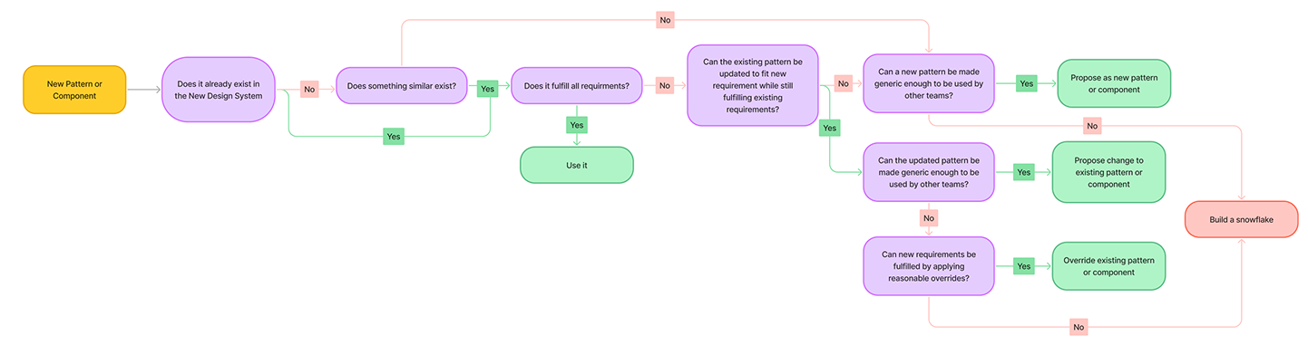
Decision Tree & Establishing sYSTEMS roLES
Tree + clear process to requesting new icons and components outlined

Laying Foundations
- Layout Grids: Enabled consistent alignment across devices, supporting complex layouts on desktop and readability on mobile
- Spacing & Padding: Switched from odd to even units (e.g. 4px, 8px) to fix misalignments and simplify layout logic
- Elevation: Standardized shadows to clearly show depth and hierarchy, streamlining builds with reusable styles
Building Intentionally
Nested Components
The concept of designing atoms, molecules, and organisms comes from Atomic Design, a methodology that breaks interfaces into smaller, reusable components to create scalable and consistent systems.
- Atoms are the building blocks, such as buttons, inputs, and text styles—basic elements that can’t be broken down further.
- Molecules combine atoms into functional groups, like a search bar (input + button).
- Organisms are more complex components made up of molecules and atoms, like a navigation bar or a card layout.This hierarchy is important because it promotes consistency, scalability, and efficiency.
- Helper Text and Labels: Interactive components, such as input fields and buttons, were equipped with descriptive helper text and labels to guide users effectively.
- Accessible Button Styles: Buttons were redesigned with higher contrast text and background colors, moving away from low-contrast styles that hindered visibility.These changes were pivotal in making the design system not only more user-friendly but also fully aligned with accessibility standards, improving the experience for a broader audience.
By designing from the smallest units upward, teams can ensure that components are reusable and cohesive across a system. It also enhances collaboration between design and development teams, as everyone works with a shared, structured framework. Ultimately, this approach saves time, reduces redundancy, and improves the overall quality of the user experience. Here area couple of examples of how Atomic Design was incorporated into our methodology while approaching designing new components:


Accessibility Baked In
Accessibility was a core focus of our new design system, ensuring a more inclusive experience for all users. Key improvements included:
- Improved Text and Background Colors: Text colors were updated from dark grey to true black, enhancing readability, while background colors shifted from light grey to shades closer to white for better contrast.
- Icon and Text Pairing: Icons were paired with text to provide clearer context and support for users relying on assistive technologies.
- Contrast Optimization: Colors were modified to meet stronger contrast ratios, ensuring legibility across all components, including buttons and links.
- Helper Text and Labels: Interactive components, such as input fields and buttons, were equipped with descriptive helper text and labels to guide users effectively.
- Accessible Button Styles: Buttons were redesigned with higher contrast text and background colors, moving away from low-contrast styles that hindered visibility.These changes were pivotal in making the design system not only more user-friendly but also fully aligned with accessibility standards, improving the experience for a broader audience.

The Before Times...


What I Learned
Foundations Matters
Without core elements like grids, spacing, and padding, even simple layouts become inconsistent and hard to scale. A design system is only as strong as its foundation.
Precision Drives Consistency
Using odd spacing units and decimal font sizes caused visual misalignment and developer confusion. Standardizing to even spacing and whole values resolved these issues and simplified handoff.
Business Value Secures Buy-In
To secure stakeholder buy-in, it was essential to tie design system improvements to measurable outcomes. By highlighting potential savings (8,000+ hours/year), increased efficiency, and revenue growth, I was able to show how design drives impact beyond aesthetics.
Accessibility Can’t Be an Afterthought
The lack of structure also impacted accessibility. I saw firsthand how foundational decisions ripple out into readability, usability, and the overall experience.